Transforming healthcare with portable, smartphone-based diagnostics.

ROLE

UX/UI & Visual Lead

TIMELINE

6 Months (2022)

TOOLS

Figma, Adobe XD

CONTEXT
Health testing that fits in your pocket and shows results instantly.

Spark Mobile Diagnostics provides portable testing kits that deliver instant results for critical health metrics like Vitamin D and CRP levels through a smartphone app, enabling testing anytime, anywhere.

PROBLEM
Fragmented tools hindered patients’ ability to manage their health results effectively and communicate with doctors.

Spark's fragmented platform required multiple apps for different tests, lacked doctor access to patient data, and suffered from inconsistent UI design - all compromising usability and efficiency.

Their previous website and apps

Their previous website and apps

P 1

"Why do I need separate apps for different tests? It’s so confusing to keep track of everything."

P 2

"I just want to send my results to my doctor easily and get their feedback without any hassle."

SOLUTION OVERVIEW
Bringing all health tests into one place, transforming fragmented diagnostics into a seamless experience for patients and doctors alike.

The app unifies all of Spark's diagnostic tests into one platform, allowing users to track results, follow guided instructions, and share reports with doctors.

Key additions include a kit glossary, doctor consultation flow, and visual consistency across app, website, and packaging.

Mobile: Key Features Implemented

Mobile: Key Features Implemented

All tests in one app & their sorting/categorisation

All tests in one app & their sorting/categorisation

Kit glossary to understand test kit contents

Kit glossary to understand test kit contents

Result visualisations, and doctor-consult features

Result visualisations, and doctor-consult features

Others at the end of this case study

Others at the end of this case study

The visual & experiential consistency - App, Website, & Packaging

The visual & experiential consistency - App, Website, & Packaging

IMPACT
Live & running!

55%

decrease in test-taking time during prototype testing, significantly improved user experience and test completion rates

100%

of testing users found the redesign more intuitive, eliminated the need to download multiple apps to track tests

Unified

fragmented testing experiences into a single cohesive platform, strengthened brand identity and boosted user retention

Launched

the redesigned Spark website - my proposed features are now live, with the unified app in active development

MY CONTRIBUTION
End-to-end design leadership.

Research Synthesis, UX Design, and Visual/UI Design for Spark Diagnostics' website and app, building a cohesive design language across all touchpoints including rebranding and packaging.

As my undergraduate capstone, I led the User Research Synthesis, UX Design, Visual & UI Design for Spark Diagnostics' website and app, building a cohesive design language across all touchpoints including rebranding and packaging.

Process + Complete Solution ↓
TARGET USERS
We narrowed on three distinct but interconnected user groups with unique needs, key to the overall experience.

Health-Conscious Individuals

Health-Conscious Individuals

1
  • Those managing chronic conditions or proactively monitoring health

  • Prefer at-home testing over hospital visits

CORE

STRATEGIC

Family

Guardians

Family Guardians

2
  • Adult children/relatives managing care for elderly parents

  • Need to monitor loved ones' health remotely

Healthcare

Providers

Healthcare Providers

3
  • Doctors requiring efficient patient data access

  • Need clear presentation of the test results

STRATEGIC

RESEARCH INSIGHTS
High-level findings that guided the design.

Different apps for different tests & visual inconsistencies

Users struggled with navigating multiple apps for different tests, leading to confusion and inefficiency.

"Why do I need separate apps for different tests? It’s so confusing to keep track of everything."

Absence of communication with their doctors

Doctors lacked tools to easily receive or analyze patient data, complicating communication.

"I'd like to get the results for my tests and share them with my doctor to get their opinion."

Underserved caregiver needs

Family guardians expressed the need to be able to easily track the health of their loved ones.

"My elderly mother has trouble staying hydrated, so this is a godsend for us to be able to catch the dehydration…"

Lack of clarity on test kit usage instructions

Inconsistent visual design across touch-points (web, app, packaging) made the products feel disconnected.

" What is a unisampler? What's a blood lancet? It's hard to figure out what objects these test kits are referring to."

DESIGN CHALLENGE
How might we create a single platform that simplifies health testing for individuals, allows family guardians to track their loved ones' health, and streamlines result sharing with doctors?
DESIGN REQUIREMENTS
Based on the above insights, these were the must-haves for our design.
  1. Combine multiple test apps into a single, intuitive platform.

  2. Enable users to share their results instantly with doctors.

  3. Enable "reverse-parenters/guardians" to keep track of their loved ones.

  4. Make test kits instructions clearer and comprehensible.

WIREFRAMING AND USER FLOWS (APP)
The mellow team had a basic wireframe & flow for the app in place which I worked with and refined to meet the design requirements.

The goal was to consolidate existing test flows, design the doctor interface, simplify test-taking, and enable family health tracking. I refined the team's initial wireframes by adding a kit glossary, guardian flows, and test-specific result visualizations.

VISUAL DESIGN AND BRANDING
Once the flow and features were decided, I worked on ideating how the final product would look.

Key design decisions:

  1. I selected an orange theme for its association with vitality, energy, and balance.

  2. The typography was paired with a hand-written font to bring in the feel of a doctor's handwritten prescriptions (yet keeping it legible!).

  3. A 3D iconography style that brought in warmth, and a friendly factor to the overall product.

FEATURE IMPLEMENTATION
Finalising the features that aimed to meet our design requirements.
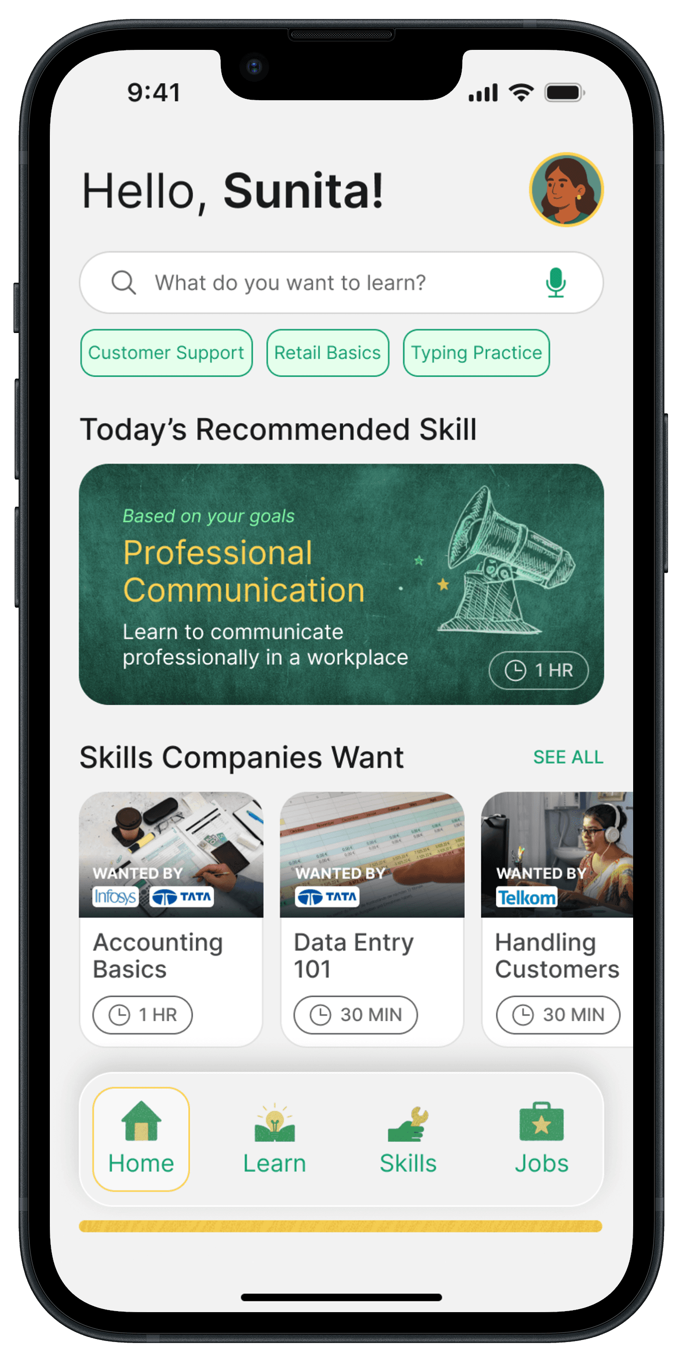
In focus: A doctor checking their patient's results and proceeding to prescribe medicines

In focus: A doctor checking their patient's results and proceeding to prescribe medicines

  1. Enable sharing of results with doctors.

  1. Enable sharing of results with doctors.

Incorporating a path choice at the onboarding stage allowed us to have separate flows for patients and doctors.


Note: The "Start a test" button at the beginning of this flow allows doctors/healthcare providers to initiate tests during in-person patient visits when patients may not have the app with them.

In focus: Onboarding that separates the flows

In focus: Onboarding that separates the flows

  1. Combining multiple test apps into one.

  1. Combining multiple test apps into one.

Spark provided 10 different testing kits. Instead of having 10 separate apps, we developed unique user flows for each test and found a way to display them on a common dashboard within a single app.


The challenge was that all the tests had very different steps and usage instructions, and we needed to streamline the user flow for consistency while addressing these differences simultaneously.

Spark's old solution: Multiple apps for multiple tests

Spark's old solution: Multiple apps for multiple tests

In focus: Consolidation of multiple test kit flows into one app

In focus: Consolidation of multiple test kit flows into one app

  1. Enable reverse-parenters/guardians to keep track of their loved ones

  1. Enable reverse-parenters/guardians to keep track of their loved ones

This was achieved by allowing users to add their loved ones from their phone contacts to the app, track their test schedules, remind them to take tests on time, and follow up on or check their reports.

This was achieved by allowing users to add their loved ones from their phone contacts to the app, track their test schedules, remind them to take tests on time, and follow up on or check their reports.

In focus: snippet of a guardian checking their family member's recent test report

In focus: snippet of a guardian checking their family member's recent test report

  1. Make test kit instructions clearer and comprehensible

  1. Make test kit instructions clearer and comprehensible

I introduced a kit glossary page that precedes the step-by-step instructions, helping users understand the terminology. This allows them to identify all the tools and confidently perform each step of the testing procedure.

I introduced a kit glossary page that precedes the step-by-step instructions, helping users understand the terminology. This allows them to identify all the tools and confidently perform each step of the testing procedure.

In focus: snippet of how the kit glossary helps users understand the terms used in the testing kit

In focus: snippet of how the kit glossary helps users understand the terms used in the testing kit

FINAL DESIGN - APP
Here's how it all came together - Some screens out of the total 283!

Onboarding and dashboards

Onboarding and dashboards

Separate flows for doctors and patients, allowing them access to their respective needs

Separate flows for doctors and patients, allowing them access to their respective needs

Test kit categorisation and unification into one app

Test kit categorisation and unification into one app

Different tests were categorised based on their purposes and all tests were incorporated into one app

Different tests were categorised based on their purposes and all tests were incorporated into one app

Step-by-step testing instructions and AR camera calibration for guided scanning

Step-by-step testing instructions and AR camera calibration for guided scanning

Kit glossary, step-by-step instructions for each test and guided scanning for users to scan their test strips with visual aids to get their results.

Kit glossary, step-by-step instructions for each test and guided scanning for users to scan their test strips with visual aids to get their results.

Data visualisations and previous test records tracking to keep a track of older test reports

Data visualisations and previous test records tracking to keep a track of older test reports

Different tests needed different metrics to be shown. Below is a glimpse of a few of them.

Different tests needed different metrics to be shown. Below is a glimpse of a few of them.

Sharing the results, tracking your loved ones' health, and profile pages

Sharing the results, tracking your loved ones' health, and profile pages

Keep track of your family members, and remind them for their tests.

Keep track of your family members, and remind them for their tests.

THE WEBSITE
After the app, I worked on Spark's website, following a similar iterative process.

I created the complete framework for the website in the form of low fidelity wireframes.

FINAL DESIGN - WEBSITE
This is how the website looked!

Below were the major improvements made compared to the previous versions -

NEXT STEPS
The app is now in development, and the first cut of Spark's website is live & running!

Along with the two main deliverables, Spark has also adopted my rebranding on its packaging and other marketing collateral, making it a cohesive product across all of its touchpoints.

IMPORTANCE
Why does this solution matter?

Portable testing revolutionized healthcare by bringing diagnostics directly to people's homes. It proved especially valuable during post-COVID recovery, helping those unable to visit hospitals due to physical limitations or other obligations, transforming medical access from a challenge into a convenience at their fingertips.

REFLECTION
Acknowledging limitations & what I would do differently.
  1. Due to time constraints, I was unable to conduct a proper usability study with the final product. We did initial testing with the prototype, but I see this as an opportunity to test Spark in the real world and build on it.

  2. Involving more number of relevant users (healthcare professionals) throughout the research and ideation process itself would be more helpful and impactful in designing a true user-centered solution with more innovative thinking (participatory design/co-design methods).

Designer by day, music enthusiast by night. Drop me a line about your project or that track you can't stop playing.

© Siddharth Hardikar

Illustrated, animated & built with love.

Designer by day, music enthusiast by night. Drop me a line about your project or that track you can't stop playing.

© Siddharth Hardikar

Designer by day, music enthusiast by night. Drop me a line about your project or that track you can't stop playing.

© Siddharth Hardikar