


Flight Paths & Powerlines

Bird migration routes over the years in a developing infrastructure landscape in North America featuring the Whooping Crane, Golden Eagle, Blue Heron, and Canada Goose.
INTERACTIVE VISUALIZATION
Bill White & Siddharth Hardikar
Migration Meets Development
From the endangered Whooping Crane to the adaptable Canada Goose, migratory birds rely on consistent flight paths that span the continent. Since 1960, power infrastructure has expanded rapidly, cutting through habitats and migration corridors. This visualization explores how four key species have responded to that change.
What you can explore:
Bird migration routes over time and their evolution
The expansion of power grids and wind zones
Potential areas of overlap or interaction
Distances travelled by each species
Physical comparisons between species to understand their migration capabilities
Meet the birds
You will spot these icons moving across the country in our visualization.
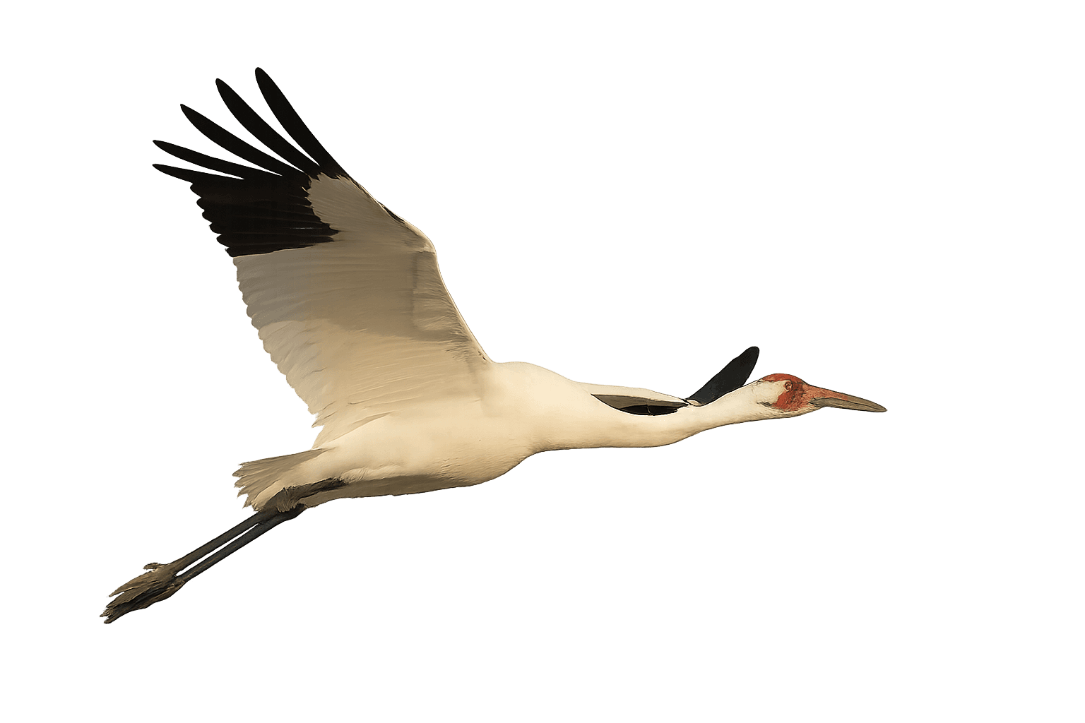
Whooping Crane
A critically endangered species with a limited flyway
Golden Eagle
A long-distance traveler with variable seasonal paths
Blue Heron
A wetland-focused bird with flexible range
Canada Goose
A highly adaptable migrant with wide distribution
Know their backgrounds
Before we dive deep into their migration paths, here are some stats on each bird.
Click on their passports to get an overview on where their home is, how many miles they travel annually, how many cities they cross, and some other physical characteristics.
PASSPORT
The Whooping Crane
Grus americana

PASSPORT
The Golden Eagle
Aquila chrysaetos

PASSPORT
The Canada Goose
Branta canadensis


PASSPORT
The Great Blue Heron
Ardea herodias
Let's dive into the visualizations!
Exhibit 1 | Bird Migration Routes in North America's Evolving Infrastructure Landscape (1960-2024)
This visualization tracks the migration routes of four key North American species—Whooping Crane, Golden Eagle, Blue Heron, and Canada Goose—against 64 years of energy infrastructure development (1960-2024). The analysis explores how these distinct migration patterns intersect with North America's evolving transmission and generation landscape.
Interactive Controls: Use pause/play to control animation, timeline slider to explore specific years, and legend filtering to focus on individual species.
What's observed in the above visualization?
The visualization shows that the bird paths haven't changed drastically through the years. However, research suggests that the infrastructure has definitely had a change in the migration paths over the years. A reason why this change isn't visible in our visualization could be the scale at which we're viewing the data - spanning multiple states and countries, we may be too zoomed out to detect subtle mile-level deviations that research has documented.
The migration paths may move over time, but we only see the data of birds that were observed. So this data is indicative but it might be missing other groups.
Exhibit 2 | Examining the Regularity of Migrations & How They Evolved Over Time
This visualization focuses on the migrations for the Whooping Crane to show the regularity over the years and the evolution over decades.
Interactive Controls: Syncs with the above hero visual, Click on the lines to change chart types
What's observed in the above visualization?
We can observe that there are some lapses in the data. In 1991 winter, there's a gap in the data collection for the Whooping Crane. Additionally, examining the whooping crane data reveals a shift toward shorter migration distances beginning in the 1990s. Whether this represents actual behavioral change or reflects changes in observation methodology remains uncertain.
For the Whooping Crane bar chart we can see -
Spring migration appears to be shifting earlier — the 1990s show higher activity in Feb–Mar than later decades.
Fall migration distances drop in the 1990s compared to the 1980s and 1970s.
CRITICAL EVALUATION
A self reflection on our output
Why Migration Paths Look Stable Despite Infrastructure Impact:
Scale Issues:
Data spans multiple states/countries - too zoomed out to catch subtle deviations
Need granular analysis (kilometer-level changes) to detect true impact
Temporal Mismatch:
Wind power only prevalent since 2000s
Oldest bird data predates wind infrastructure
More fossil fuel interactions in historical data
Narrative Opportunity:
"Wind kills birds" largely fossil fuel industry messaging
Our data shows more fossil fuel plant interactions than wind
Can counter misleading narratives with actual migration data
Technical Limitations:
Flock grouping algorithm too resource-intensive for large datasets
Would work well for Canadian geese but computationally prohibitive
Next Steps:
Explore the statistical significance of small changes that we are able to see
Explore better ways of grouping to see if longer chains of migration can be created