


Flight Paths & Powerlines

Bird migration routes over the years in a developing infrastructure landscape in North America featuring the Whooping Crane, Golden Eagle, Blue Heron, and Canada Goose.
Bill White & Siddharth Hardikar
INTRODUCTION
Exploring the collision course between human infrastructure and avian migration from 1960 - 2024.
As North America's energy infrastructure has expanded over the past 60 years, we examine whether the migration routes of Whooping Cranes, Golden Eagles, and Canada Geese have been impacted.
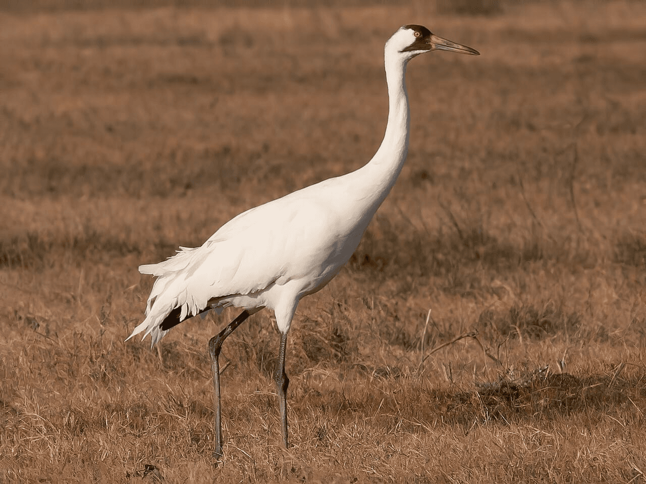
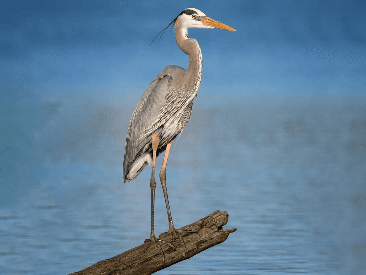
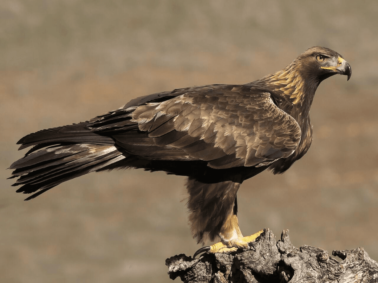
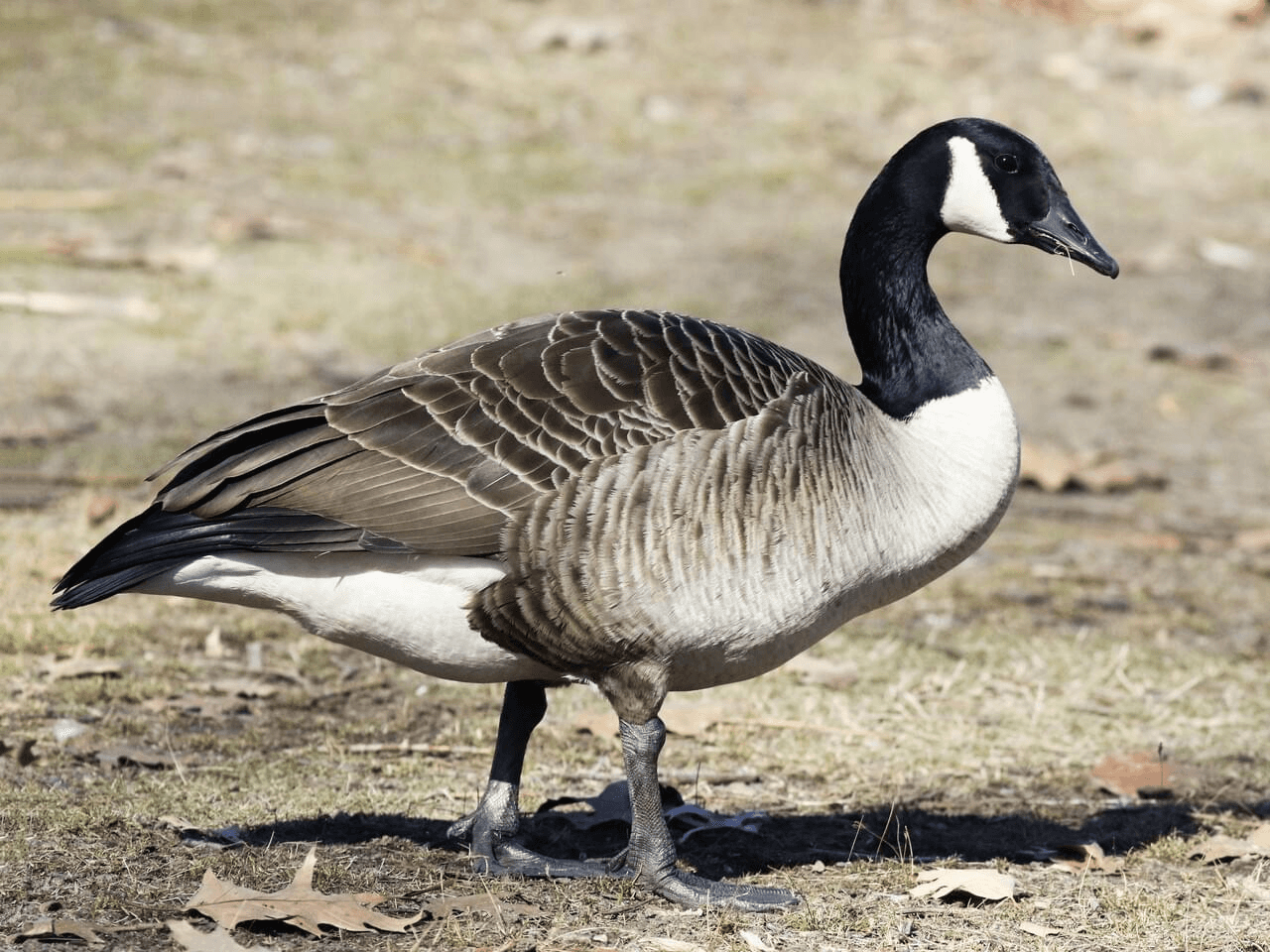
Image Credits: Whooping Crane - Tom Johnson / Macaulay Library, Golden Eagle - Miguel Rouco / Macaulay Library, Great Blue Heron - Daniel Grossi / Macaulay Library, Canada Goose - Max McCarthy / Macaulay Library
Goals of this visualization & Our Target Audience
Reveal the months these birds fly in and visually see the extent of their journey

Examine route changes over time and possible connections to infrastructure growth.

Support bird enthusiasts and conservationists with accessible insights into species migration and potential impact factors.

Compare species through key characteristics: size, wingspan, and migration metrics, to understand their capabilities.

Process ↓
Here's an overview of our datasets!
Key information about the datasets we worked with for this visualization.
Bird Banding Data - USGS
84+ million records (1960-2024)
1,000+ species tracked via USGS program
Contains: locations, dates, bird movements
EIA Energy Atlas
Includes data from 1960, allowing us to match with the bird dataset
Contains: Top 6500 generators
Data Challenges
Scattered files
Data split across 57 CSVs by bird type!
Invalid Dates
Records with impossible days/months (e.g., day > 31 in a month)
Inconsistent Naming
Same species listed under multiple names per SPECIES_ID
Broken/Cumbersome API
Having to build/pull data from a script
How did we make it less overwhelming?
01
We grouped birds by flocks of birds to have flock IDs instead of individual bird IDs.
02
We grouped bird sightings by months instead of individual days to ensure we're not overwhelmed and to make the data regular and expected.
03
Used path segments instead of GPS points to show continuous migration routes rather than scattered data points.
This is how our rudimentary explorations looked
We explored various ways of visualizing the same data and each visualization had its own "hero" focus point, helping us decide what we wanted to show in our final visualization.


Initial usability testing & resulting changes
Initially, we focused majorly on the bird dataset, and the other key aspect of our visualisation was missing - the infrastructure data.
Insight
Change
Too many filtering options created decision paralysis
Split into focused, single-story visualizations giving users a clear direction on what to see
1 user mentioned the need for clearer storytelling and context-building
Implemented ways to guide the users into our visualization in a fun way. eg. Passports.
Interest in connecting patterns to environmental factors
Overlay infrastructure development with migration routes
A design system to ensure consistency

Drumroll… Here's the Solution ↓
FINAL SOLUTION
Meet our 4 birds of focus!
Since these journeys involve extensive travel, we created species 'passports' showing each bird's origin, annual migration distance, and seasonal habitats. These stats provide essential context for understanding the upcoming visuals.
PASSPORT
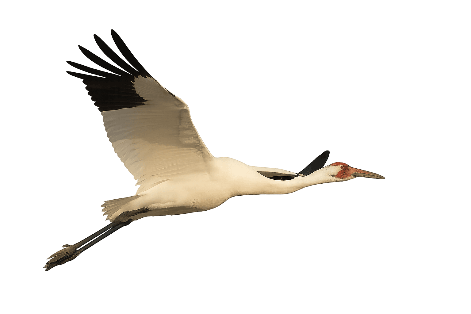
The Whooping Crane
Grus americana

PASSPORT
The Golden Eagle
Aquila chrysaetos

PASSPORT
The Canada Goose
Branta canadensis


PASSPORT
The Great Blue Heron
Ardea herodias
Let's dive into the visualizations!
Exhibit 1 | Bird Migration Routes in North America's Evolving Infrastructure Landscape (1960-2024)
This visualization tracks the migration routes of four key North American species—Whooping Crane, Golden Eagle, Blue Heron, and Canada Goose—against 64 years of energy infrastructure development (1960-2024). The analysis explores how these distinct migration patterns intersect with North America's evolving transmission and generation landscape.
Interactive Controls: Use pause/play to control animation, timeline slider to explore specific years, and legend filtering to focus on individual species.
Exhibit 2 | Examining the Regularity of Migrations & How They Evolved Over Time
This visualization focuses on the migrations for the Whooping Crane to show the regularity over the years and the evolution over decades.
Interactive Controls: Syncs with the above hero visual, Click on the lines to change chart types
CRITICAL EVALUATION
A self reflection on our output
Why Migration Paths Look Stable Despite Infrastructure Impact:
Temporal Mismatch:
Wind power only prevalent since 2000s
Oldest bird data predates wind infrastructure
More fossil fuel interactions in historical data
Narrative Opportunity:
"Wind kills birds" largely fossil fuel industry messaging
Our data shows more fossil fuel plant interactions than wind
Technical Limitations:
Flock grouping algorithm too resource-intensive for large datasets
Would work well for Canadian geese but computationally prohibitive
Next Steps:
Explore the statistical significance of small changes that we are able to see
Explore better ways of grouping to see if longer chains of migration can be created